
Icons and Boxes
How can you present numbers and information in an appealing way?
As explained in the introduction, long texts distract from the spoken word. The question arises, how to design the slides with less text?
The solution is simple: If you have an image that describes the topic well, go back to the image and, if necessary, add boxes with more bullet points.
If there is no image or other type of visualization, cherry-pick the most important data and present it with specific icons. Instead of overwhelming the audience with vast amounts of data, you can direct their attention to the key data.
With the help of boxes or lines and other shapes, you can delineate the individual points from each other.
You have already learned the basics of this in the outline lesson.


More tips
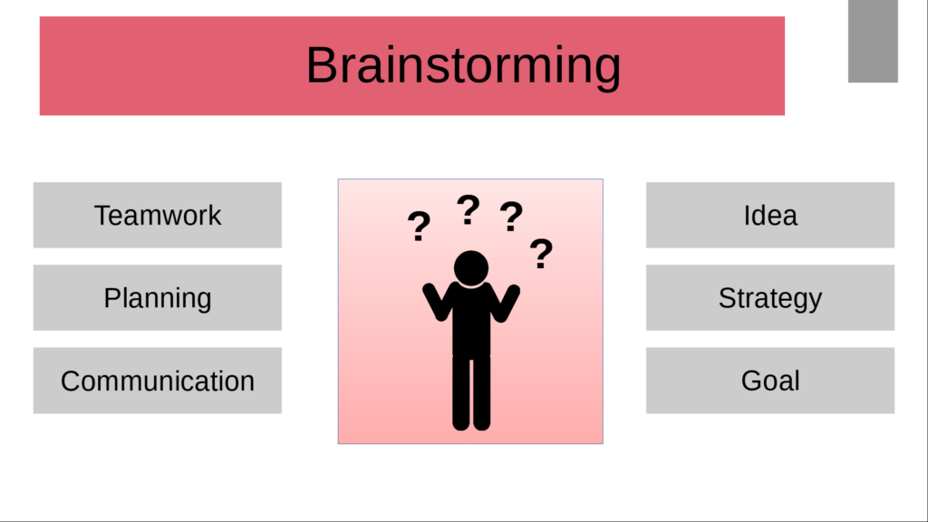
Sometimes, you may need to fit different information on one slide. To clearly distinguish this information from each other, you can use boxes or shapes.
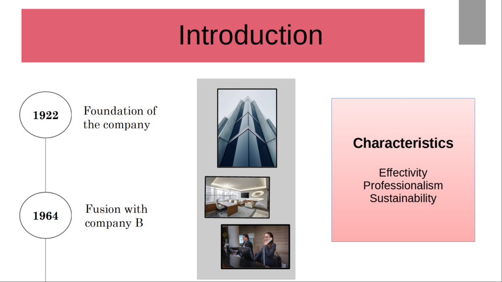
Links are e.g. different types of information packed on one slide. The gray box in the middle clearly separates the images from the other information. The pink box on the right offers more information and on the left you can see a timeline that will be discussed in more detail in the next chapter. This box division is also particularly good for comparisons such as comparisons, pro-contra lists, but also for diagrams and their explanatory information.
You can also slide boxes on top of each other, as you can see in the example on the right. Different colors of the boxes ensure a clear hierarchy. An illustration like the one on the right box spices up the design even more.