Function and Benefits of Diagrams
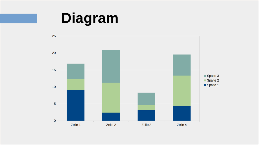
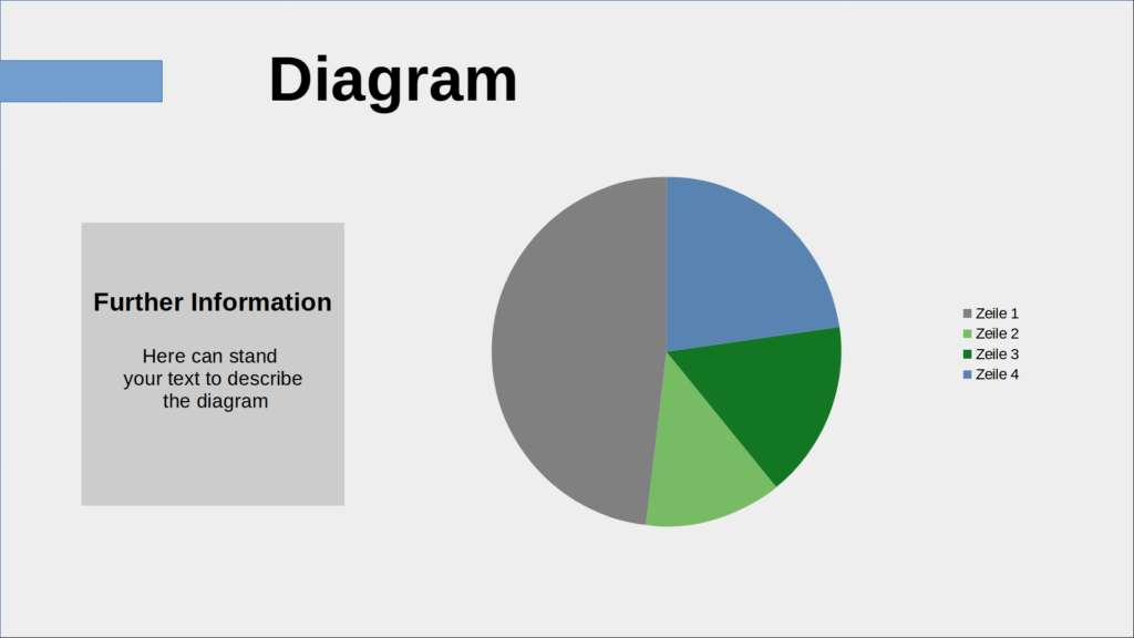
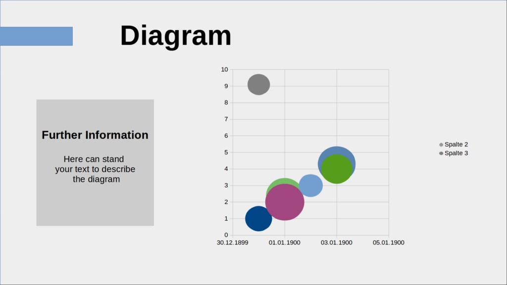
The advantage of a chart over dry numbers or an even drier table is obvious: the proportions are clearer. This means that the information can be better processed in the brain.
You can add a standard diagram to the presentation via “Insert” – “Diagram” and you can quickly read how to work with them on the Internet. Here I would like to introduce you to a few alternative designs and diagrams.
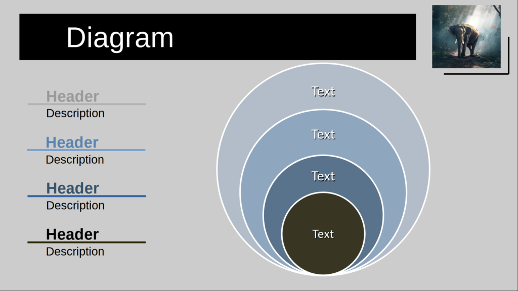
Hierarchy and Relation Model – Templates in Impress

Instead of accessing the usual diagrams, you can open hierarchy models as shown on the left and below, as well as lists and other relation models in Impress. Under the icons in the right bar, click on “Gallery”. Select “Charts” and find the appropriate chart design.
You can customize the colors and size to suit your needs.
You can also use the elements under “Flowcharts” to create your own diagrams.
Create your own percentage charts
Instead of accessing existing diagrams or components, you can also create your own diagrams that are specially adapted to your needs.
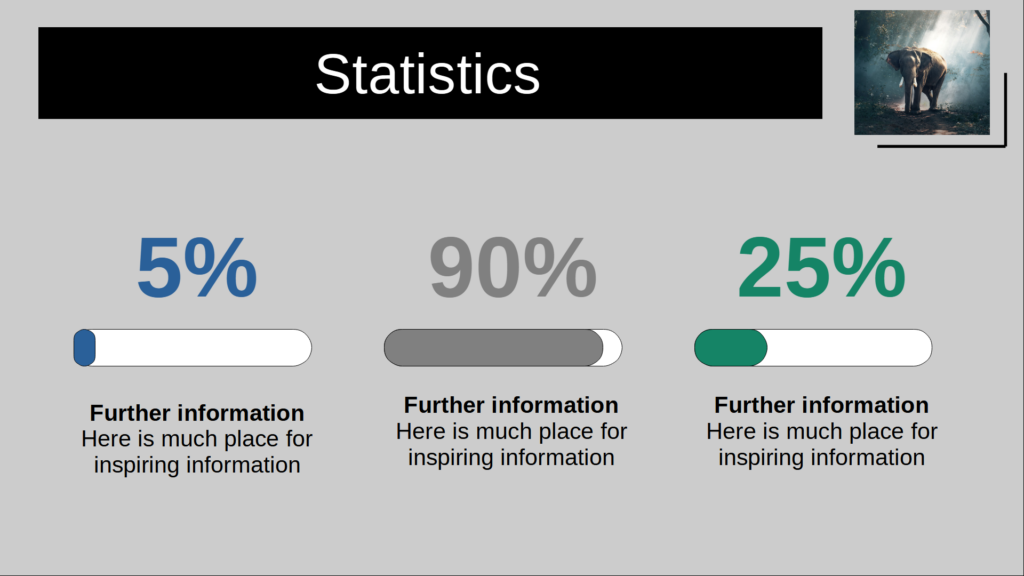
Shown on the left is an alternate bar chart in percentage. To do this, use a rounded rectangle in a neutral color and form it as a bar. Place a colored rounded rectangle on top of it, also in the shape of a bar. Adjust the length to the desired percentage subrange.
Add the text information and repeat the procedure for the rest of the chart bars.
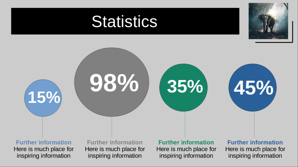
Another method of displaying percentage data or proportions can be seen in the image on the right. Here, circles are used to reflect the percentage mass. To do this, add circles in different colors. Determine which size symbolizes 100% and adjust the circle sizes specifically.
Now you can add lines and texts.
