
“Agricultural Major for College”
A template from SlidesCarnival
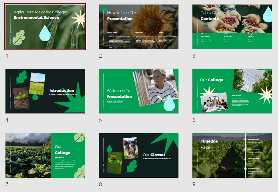
The design has a clear structure and choice of colors. The color choice consists of a strong shade of green and black. To loosen things up, photos and recurring icons are always inserted. Some photos dominate the background with clear lines, additional photos are smaller and always rotated, thus loosening up the slides. On the left side, there is also a line on each slide with space around the college name. It’s a nice way to personalize the template and make it look more professional.
Howmany master slides do you think you’d need to create for this design? (1)
Feel free to test this presentation here >>
Criticisms and challenges

The design is very nicely created. However, there are a few things you should pay attention to.
Since it’s a very image-focused design, personalization would require you to replace images on sites like “Our College,” “Our Professors,” “About Us,” and “Our History” with your own.
In order not to destroy the design, you also need high-quality pictures of your team, college, and more. Otherwise, these pictures will quickly fall out of line and the professional impression will be lost.
In addition, the font size on the slides is endowed with 11 or 10 pt. That’s too small. In general, the font size should be at least 14 pt.
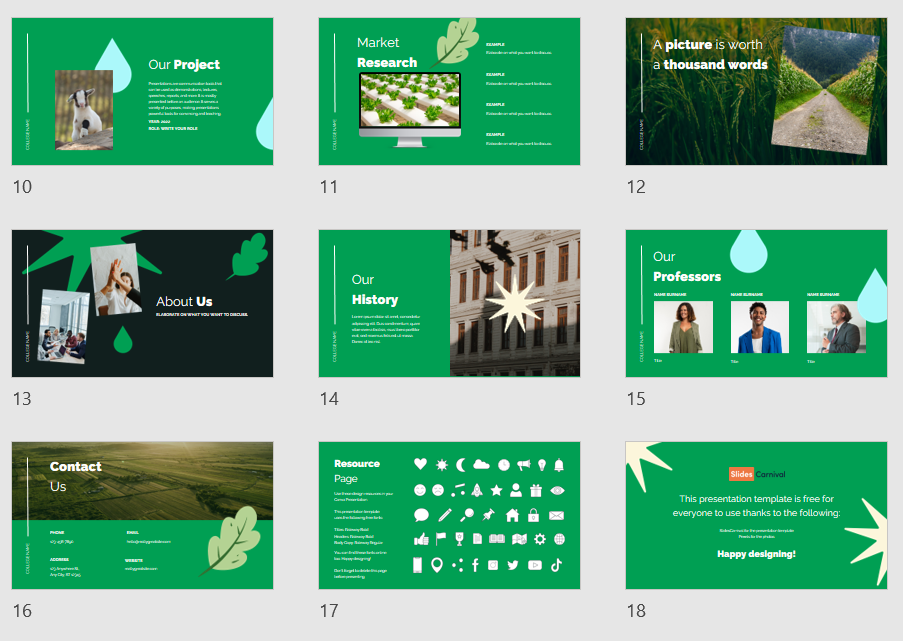
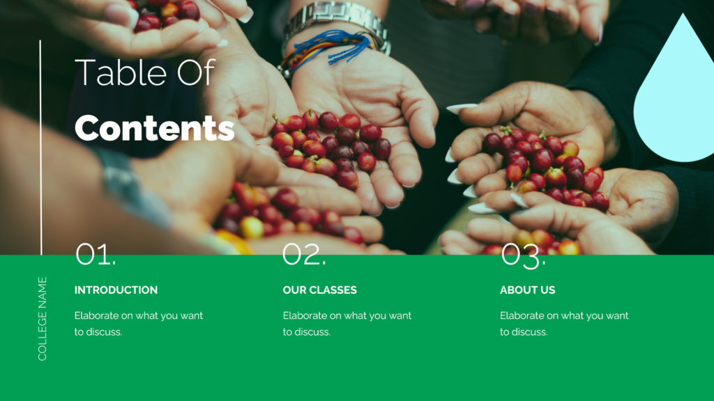
The design is also designed for little information. The outline page only allows 3 bullet points. For most departments, this is not enough.
However, if you add more dots and bring the design together, the overall look will be destroyed.
What options do you have for further bullet points? (2)
The slides are generally designed so that the spoken word dominates and the images have an effect. This slide is therefore particularly suitable for presentations rich in images. The aim here is to get to the heart of the matter in a short and crisp way. For more detailed and less image-focused content, the design would need to be adjusted.
Solutions
(1) I would create 10 master slides here. For each background image, I would have to create a separate master slide. However, I can easily add the smaller images to my slide as an image without having to create an extra master slide. The same goes for the icons. Sometimes it is also possible to insert the image on the left, right top or bottom on a normal slide and set it in the background. However, if you don’t want it to slip, it’s worth creating a master slide.
(2) You could slide to the right with a slide transition to the next slide. This way you create a smooth transition to the next slide and it gives the impression that the two slides belong together.
Alternatively, you could choose a different master slide design and put more bullet points on top of it.