A few years ago, I was already very enthusiastic about creating PowerPoint presentations. Then I stumbled across this quote from Steve Jobs, the founder of Apple:
“People who know what they are talking about don’t need PowerPoint”
(German: “Who knows what he’s talking about, doesn’t need a PowerPoint”)
Steve Jobs
The first good point is that we don’t work with PowerPoint, but with the free variant Impress;)
But let’s put the fun aside for a moment.
The question this quote raises is:
Why do we need a presentation program?
What is its function?
At the time, it scratched my ego a bit that such a well-known and famous person thinks so badly about PowerPoint or presentation programs in general. It took me some time to realize that I had a similar view to Steve Jobs. In really good presentations, you listen spellbound to the presenter and his words are the focus. In the end, a presentation is only the pictorial extension of his words. And what is said cannot be equated with the presentation. This means that the presentation is not necessarily comprehensible on its own, but needs the presenter as an essential element.
The common problem that Steve Jobs picks up on here is that the majority of presentation users use presentations as sticky notes, where exactly what they say is written on them.
If, as Steve Jobs says, you use a presentation to be able to read, you can indeed do without a presentation program and rather use handwritten notes.
Presentations are not sticky notes
Presentations are thus a means of visualization and are intended to support the spoken word, not replace it.
While the spoken word appeals to your mind and rationality , a visually-oriented presentation addresses your emotional and creative side. When presentations are used correctly, we can engage and reach people on different levels. And the audience listens to your words instead of getting lost in the text of the presentation.
Hacks for a good presentation
Listed below are 5 hacks that provide the basis of a good presentation and form the basis for this Impress course.
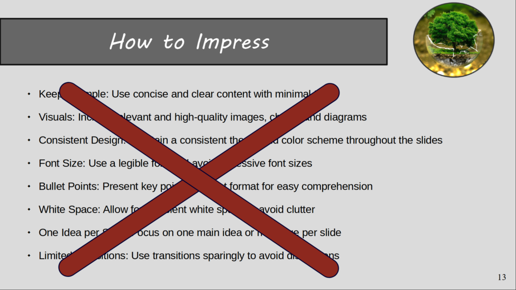
#1 – Be sparing with text
One of the most common sources of error in creating a presentation is to put your own notes unfiltered on the slides.
Before the speaker gets to point 2, our brain has already read the whole list, no longer listens attentively and is already bored, while the speaker explains his key points over the next 10 minutes.
Short, concise bullet points are much more effective and keep the listener focused on the presentation.
Not so !

You don’t have to and shouldn’t put everything you say on the slide.
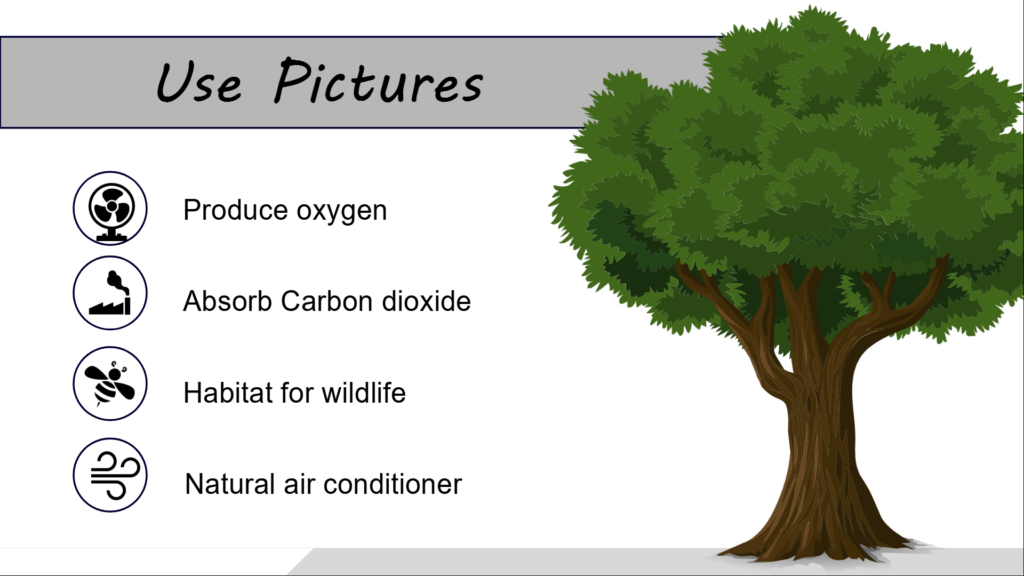
#2 – Visualization

Unlike texts, our brains can process images and visualizations much faster. In addition, more complex and abstract issues can be identified and understood much more easily. Studies have shown that visual representations have a more lasting effect on our memory. In addition, images and visualizations remain anchored in our long-term memory for longer.
If possible, try to replace or supplement complex relationships or the written word with pictures, diagrams, or organizational charts.
#3 – Clear Structure
On the one hand, a clear structuring applies to your presentation, but of course also to your presentation design. A recurring structure and a consistent color palette give the listener the opportunity to focus on the core of the message without getting lost in the color chaos. In addition, the brain can process clearly structured information better and faster.
#4 – Directing Attention Through Animations
As you read before, directing attention is the key to a good presentation. If the audience is glued to your lips, you’ve done everything right.
Presentations are often not animated and a complete train of thought or further information is displayed on a slide at the same time. As a result, the audience reads the conclusion prematurely, thinks about it on their own, and no longer listens to your oral presentation. It makes more sense to guide your audience step-by-step through each train of thought or point by animating each point individually.
#5 – Less is more
In a presentation, it’s often tempting to play with the design, colors, and animations, and include as many visual elements as possible. In the course you will learn a variety of new tips and tricks and I invite you to try out all the gimmicks.
But when it comes to an official presentation, less is often more. A simple and clean design with a consistent color palette allows listeners to focus on the content and better understand the message. A little special animation every now and then can loosen up the presentation. However, use the animations purposefully and don’t try to pack everything you’ve learned into the presentation. There will be more opportunities where you can shine with your newly learned skills 🙂
The ultimate goal of a good presentation is to support the spoken word
(and not to be distracted from it) !
