Use of Icons
In the previous lesson, you learned how to create appealing outlines using boxes. Icons can also be used for further and better visualization.
In the introduction, we have already clarified that visual representations are easier to process mentally than long texts and better support the spoken word.
You can extend the creation of the boxes that you have already learned in the previous lesson with icons. Instead of using the circles as a numbering aid, you can insert thematically appropriate icons as shown below.


GNP. 1 & 3: Icons of Flaticon.com
GNP. 2: Icons of flaticons.net
Where can you find commercially free icons?
LibreOffice Impress offers a variety of visualization aids as well as other media in the right bar under the “Gallery” icon. These include, for example: various diagrams, sounds, arrows, network-related graphics such as laptops, computers, smartphones and more.
Under the category Symbols you will also find some icons that can be used for our purposes.
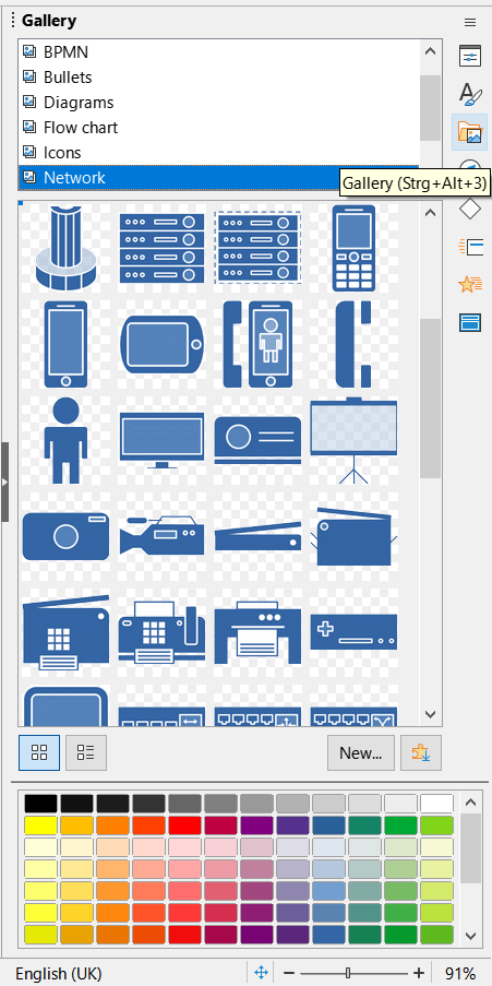
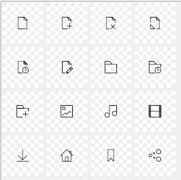

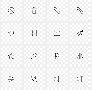
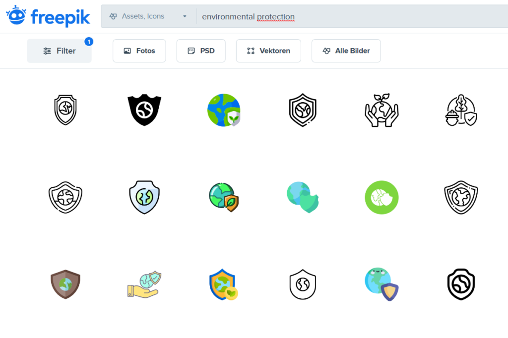
However, the selection of these icons is limited. The topic of “Environmental Protection”, e.g. would be difficult to display with the icons of LibreOffice Impress shown above. Pictures for trees, animals or similar are not available there.
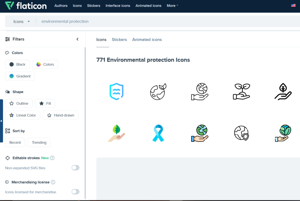
You can find a larger selection online.
- Under flaticons.net , commercially freely available icons are offered without the need to specify the source. However, the selection is limited to monochrome and simple icons. However, you can change the color of the icons
- The website flaticon.com offers a larger and stylistically broader selection of icons. However, the colors and styles are predetermined and cannot be changed. For free use, the author must also be credited and the number of downloads per day is limited
- Another website is freepik.com. This page is similar to flaticon.com and also requires attribution. However, Freepik offers a wider range of photos, videos, and vector images.

Note
The icons of Impress, Flaticon and other websites differ greatly in style and color use. In a presentation, you should make sure that you use consistent and matching icons.
